Tammy Wang
中文EN日本語한국어

Works

Zines and artists’ books created under the publisher moro young.

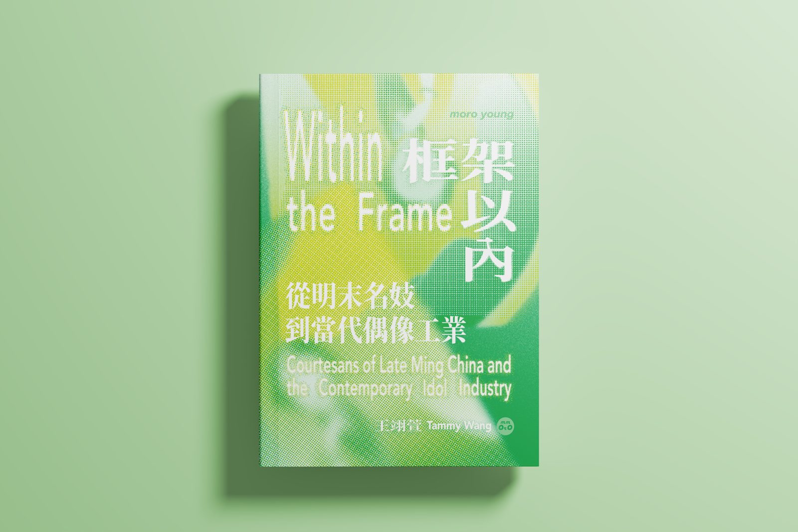
Cover of Within the Frame, Risograph-printed in green and yellow halftone

Within the Frame: Courtesans of Late Ming China and the Contemporary Idol Industry

Year
2026
Pages
104
Size
17.5 × 12.5 cm
Printing
Risograph
Edition
300 (Available)

The forms keep changing, but the structures that make women serve the needs of others have never loosened.

Continuing the inquiry of her earlier works I Hate This! and Sorry for Being Cute w, Tammy Wang asks how women, from the past to the present, have been gazed at and looked upon in painting, photography and digital media.

Printed in two-color Risograph, the book begins with Ye Yanlan, a frustrated late-Qing literatus who painted portraits of eight late-Ming courtesans and wrote their short biographies. Unsuccessful in his official career, he projected his own sense of unrecognized talent onto these women and painted them as perfect, virtuous figures. The book then extends to the “Girl Crush” style in K-pop, which seems to give female idols the freedom to assert themselves, though that freedom is still directed by male producers.

Late-Ming courtesans slipped into literati gatherings dressed as men; female idols sing fearless lyrics in the “Girl Crush” style. Four hundred years apart, these women have never left the frames that bind them. Placing the Eight Beauties of Qinhuai side by side with K-pop imagery, the book asks, from the perspective of the gaze and image production: who decides what they look like?
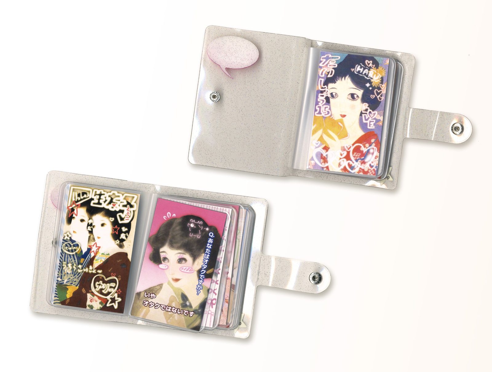
Sorry for Being Cute w: two clear glitter card albums holding bijin-ga prints decorated in purikura style

Sorry for Being Cute w

Year
2025
Pages
24
Size
9 × 11.5 cm
Printing
Digital print / card album
Edition
40 (Sold out)

Bijin-ga, pictures of beautiful women, are a common genre of ukiyo-e. Most of their painters were men, and the women’s faces follow a formalized beauty that reflects the aesthetic standards of each era and the male gaze.

Today, as technology keeps advancing, women’s anxiety has intensified rather than eased. The retouching style of Japanese photo booths (purikura) is one example of excessive beautification: exaggerated big eyes, slender noses and sharply pointed chins all reflect a longing for a perfect image.

Combining bijin-ga with the visual format of purikura, and the stereotyped femininity found in both, this work examines how the male gaze, together with women’s own anxiety, shapes ideals of feminine perfection that can never be reached.

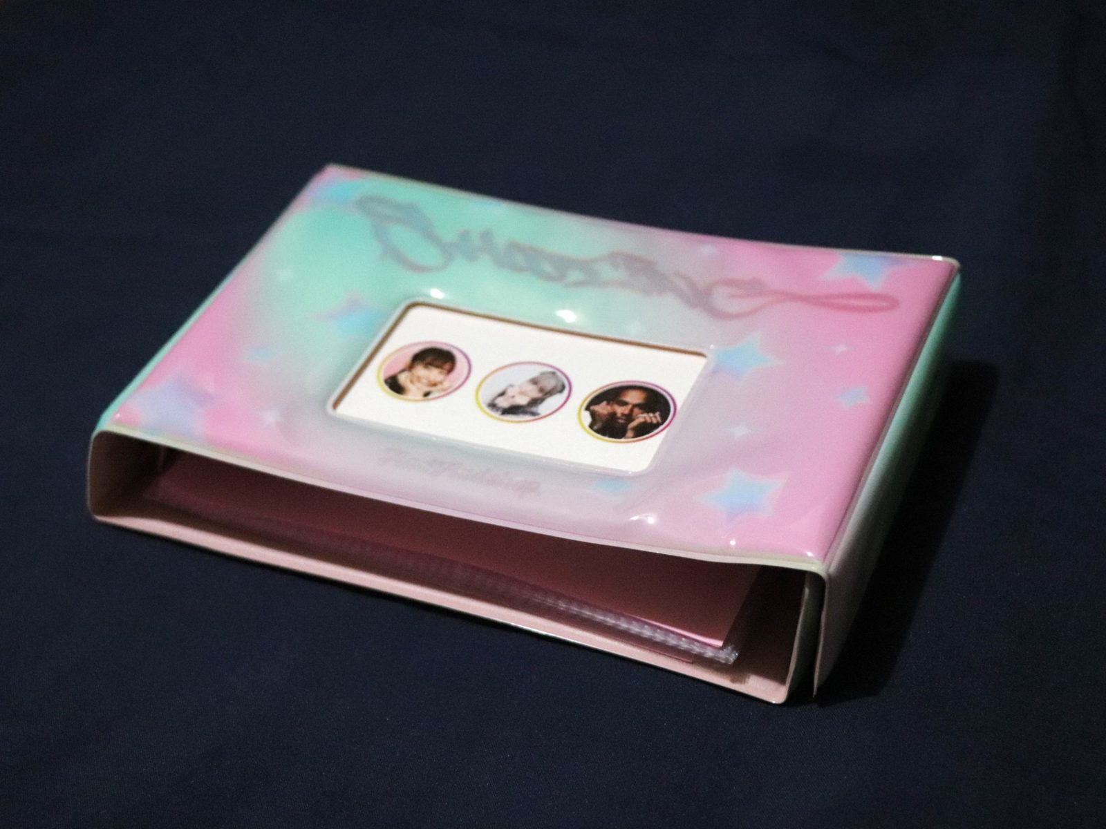
I Hate This!: a card album with a pink and mint-green gradient cover

I Hate This!

Year
2024
Released
2024.11.23
Pages
42
Size
19 × 13 cm
Printing
Digital print / card album
Edition
100 (Available)

I Hate This! draws on internet memes and Japanese popular culture to criticize the male gaze and the sexualization of women’s bodies, as well as the severe gender inequality in Japanese society.

The images include female figures shaped to satisfy male aesthetic standards, young women infatuated with host club hosts, and the self-images women package for the mass media. The text imitates “ojisan-style” writing, the message style associated with middle-aged men, and adds lines from adult manga and familiar onomatopoeia, exposing the sexual connotations hidden in the other images and words.